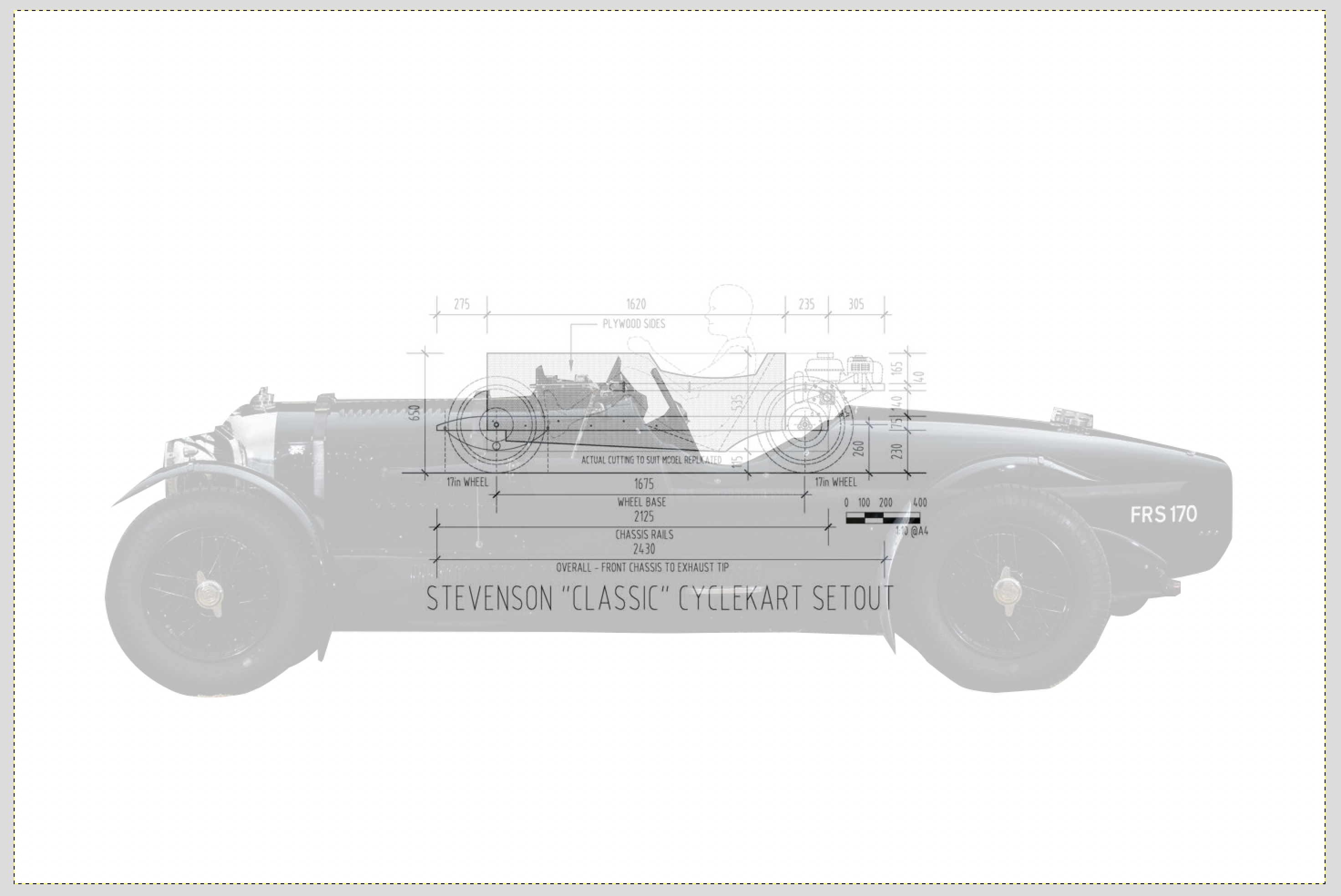
To determine the dimensions of your Cyclekart one method used is to overlay an image of your chosen inspiration car on top of the basic 'Stevenson Setout Diagram'. This will allow you to use the dimensions on the setout diagram.
This does however require that you employ some 'photoshop' skills. This might be straightforwards for some but is like voodoo to most people. So to help assist those who might find this a little challenging the following walk-through should help.
Prerequisites
- A photo of your tribute car (side view)
- The Stevenson Setout plans
- A photo manipulation program.
Just a quick note on photo manipulation programs. Generally the de-facto tool for this kind of stuff is Adobe Photoshop. However, this is an expensive program and generally not accessible to most hobbyists. So I'm going to take a leap and assume that if you already subscribe to Photoshop you most probably already know how to do this. So to make this more accessible to the rest of us I'm going to use a different program for this called 'GIMP'.
Whilst 'GIMP' might make you think of a scene from the film Pulp Fiction, it is an acronym that stands for Gnu Image Manipulation Program and is a free to use Open Source photo editing program. It is comparable with Photoshop in its basic operation and can easily handle overlaying an image. You can download it here - https://www.gimp.org/
Steps
- Open largest image
- Import second image as new layer
- Crop tribute image to remove background
- Change opacity of tribute layer
- Scale layers to match wheelbase
Step 1 - Import largest image
Open GIMP and using the 'Open' option in the file menu browse to open the larger of the two images. This will most probably be the image of your tribute car.
Step 2 - Import second image as new layer
Next using the 'Open as Layers' option in the file menu, browse to and open the Stevensons layout diagram. You should see a new layer with the smaller layout image shown in the middle of the screen like this...

We'll refer to this as the 'setout' layer (and the other layer as the 'tribute' layer.)
Step 3 - Crop tribute image to remove background
Next we want to crop the background out of the tribute layer. This has a few steps to it.
Firstly we need to hide the setout layer. We do this by clicking the 'eyeball' icon in the layers menu. Then we need to select the layer with the tribute car image on it by clicking on it in the layers pallet. This makes it the active layer. This ensures that the work we do next happens on the correct layer. Your layers pallet should look something like this...
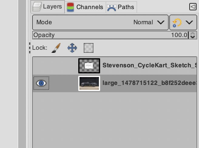
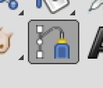
OK. Using the 'Paths tool' we are going to draw a path around the car. The paths tool looks like this...
You can zoom in on the image to make this part a little easier by using the drop down menu at the bottom of the screen.
Then you can create a path around your image by clicking along the outside of the car. If you need to trace a curve you can click-hold-drag. To do this, when you initially click make sure that you are on the outline, then click and hold the button and then move further along the curve before releasing. You will notice that the path then follows the curve. It will also display 'drag handles'. These are two lines with square boxes that allow you to adjust the curve. It takes a little practice to get perfect results with curves, but you can easily just use lots of shorter straight lines if you are finding curves a little tricky.
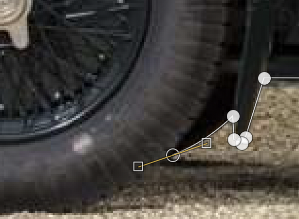
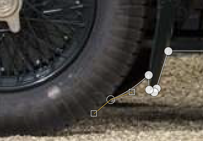
You can adjust the drag handles or the location of points by clicking on them and dragging them to the new locations. But, if you do go back to adjust the position of a point or a drag handle make sure that you then re-select the last point before recommencing tracing the outline.
If you mess a point up simply hit undo and you can then try it again.
To move around the image hit the space bar and you will be able to drag and move the entire image around the viewport.
When you get to the last point you need to join it to the first point to complete the path. To do this you need to hold down the command key before clicking. When you hold the command key down you will see the cursor change to two circles. This means you can join the ends of the path together.
OK. Now you have the path drawn we can use the path to select the parts of the image we want to delete. To do this you need to view the paths pallet. You will find this underneath the layer pallet. You can access it by clicking the 'Paths' tab just above the layer pallet. It should look something like this...
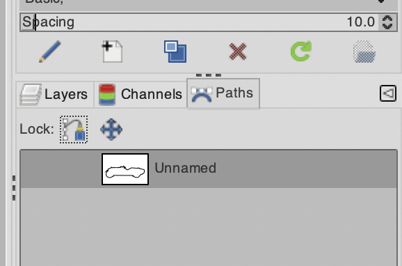
Right click on the path in the list and select 'Path to Selection'. This will use the path that you have drawn to select everything inside the path. Next you need to invert the selection by using the 'Invert' option in the 'Selection' menu at the top of the app. This changes the selection to everything outside of the path.
Now you can simply hit the 'Delete' button to delete the background...
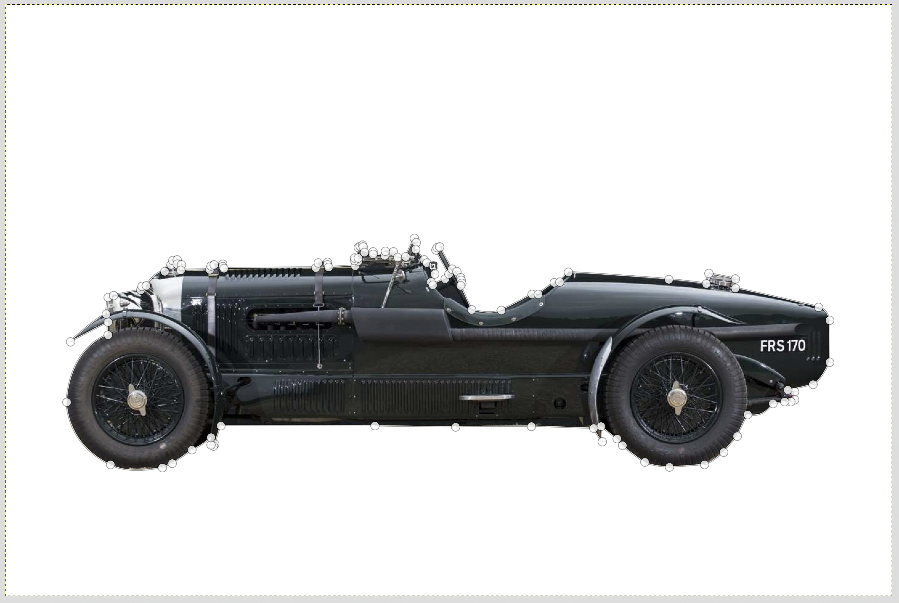
Cool huh.
Step 4 - Change the opacity of the Tribute Layer
To be able to overlay the tribute car over the setout plans we need to make the tribute layer partially transparent. This will allow us to 'see through' the car to the setout layer below. This is pretty straightforwards to do. However before we do this we need to turn the setout layer back on so that we can see it and get an idea of how much transparency we need. To do this you will need to go back to the layer pallet by clicking on the 'layer' tab and then click on the layer eyeball to make the layer visible again.
Next you want to make sure that the setout layer is below the tribute layer. To do this simpy drag the laters in the layer pallet to rearrange them. Layers at the top of the list are above layers lower in the list.
Once again, you need to make sure that you re-select the tribute layer before we make any changes as any edits you make will be carried out to the active layer only, even if you cannot see it. Just click on the layer in the layer pallet to select it.
With the layer selected you will see an 'Opacity' slide bar at the top of the layer pallet (see layers pallet image above). This is nominally set to 100%. To change the opacity you can drag the slider, use the up/down arrows or select and type a new value.
Try changing the value to 50%. It should look a little like this...
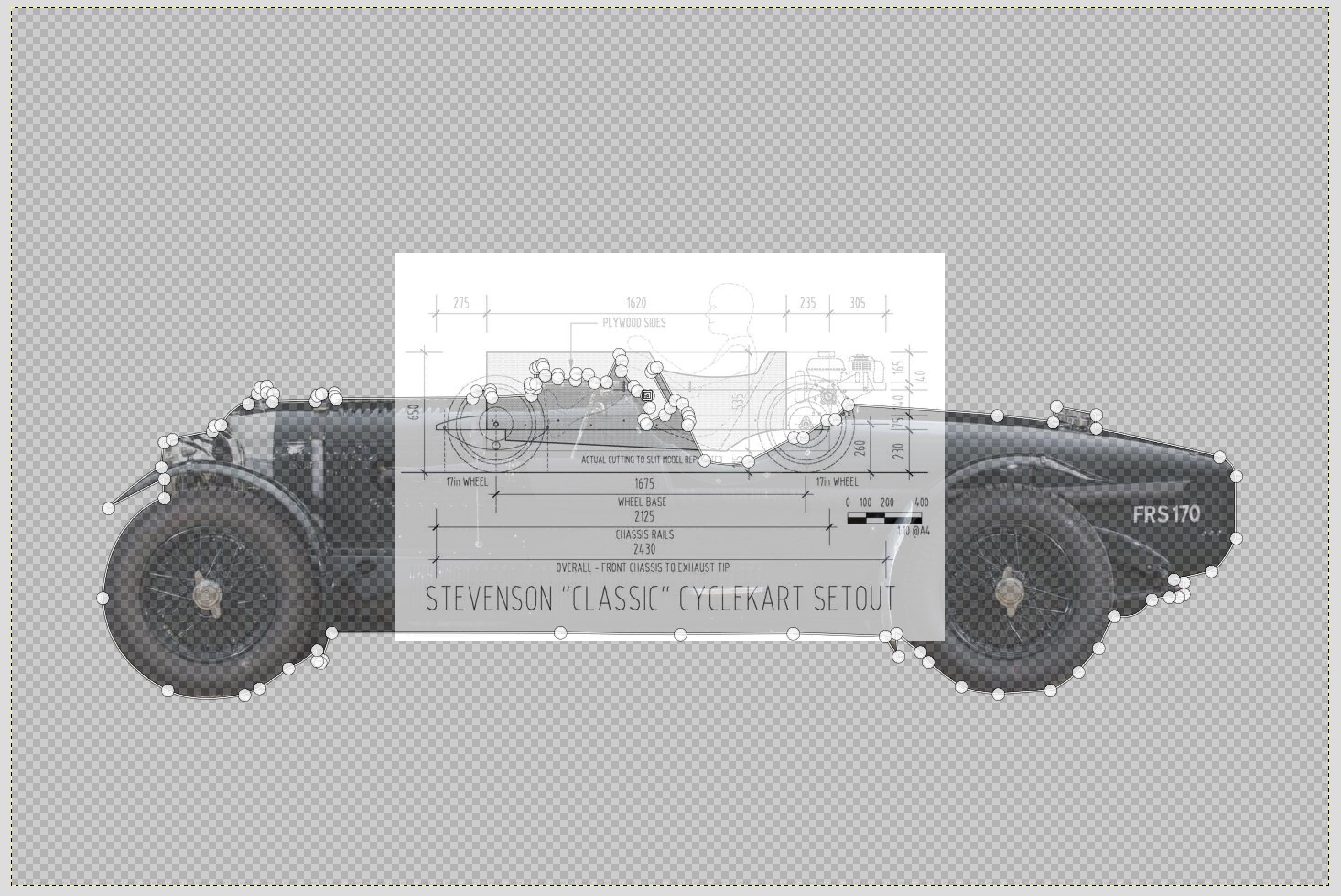
Note that the tribute layer is on top, so we are actually looking through it at the layer below. Ignore the difference in size, we will deal with that next.
5 - Scale layers to match wheelbase
To bring everything into line we need to match the scales of the two images. The best way to do this is to use the wheelbase as a guide. However before we change anything we need to make sure that the smaller layer is extended to match the larger image otherwise the results will be cropped. To do this select the Setout layer and then select the 'layer to image size' option from the 'Layer' menu at the top of the app. It should then look something like this...
Note how the layers canvas size has increased to fill the screen.
Now lets make sure that we don't have anything selected by using the 'None' Option in the 'Select' menu at the top of the app.
Next we can use the 'Scale' tool from the Tool pallet...

And then click on the image to display drag handles.
You can them manipulate the size of the layer by dragging the handles. You can reposition it by using the drag handle in the centre of the image. If the handles need to be dragged past the edge of the image it is often easier to zoom out a little using the drop down size menu at the bottom of the screen.
Try to line up one wheel and then drag the side of the image until the second wheel lines up. You may need to reposition the image a few times until you get it perfect. Patience is key.
If for some reason you find that you cannot see through the image you can temporarily change the opacity of the setout layer as you did previously for the tribute layer.
You should end up with something like this when you are done...

You can now use the measurements shown on the setout image to determine the layout of your Cyclekart.
Some points to note are that the Cyclekart is not a true scale model. Whilst the overall car is approximately half scale, the wheels are larger which gives the overall impression that the Cyclekart is a caricature of the tribute car and adds to the 'cute' aesthetic. Also the drivers compartment at half scale is a little too small to fit a full scale human, so you will likely need to enlarge this to suit.
You may also need to tweak other aspects of the design to suit. For example in the image above the engine sits above the bodywork. This is most likely as the scale of the car is a little small. The car in this case is a Le Mans Bentley, which had an enormous wheelbase. Ettorre Bugatti actually described it as the "The fastest lorry in the world". Matching the wheelbase results in a more squashed result. To fix this you could extend the wheelbase a little to match the tribute car a bit more, but this would have a negative affect on the handling, or you could just increase the body height to compensate, which is the better solution. The overall goal is a representation of the tribute car, not an exact scale model. You are essentially just trying to capture the essence of your tribute car, so don't get too hung up on making it perfect. If you think of it as a caricature, then you are on the right track.
